Weenfo - Redesign & New features
Overview
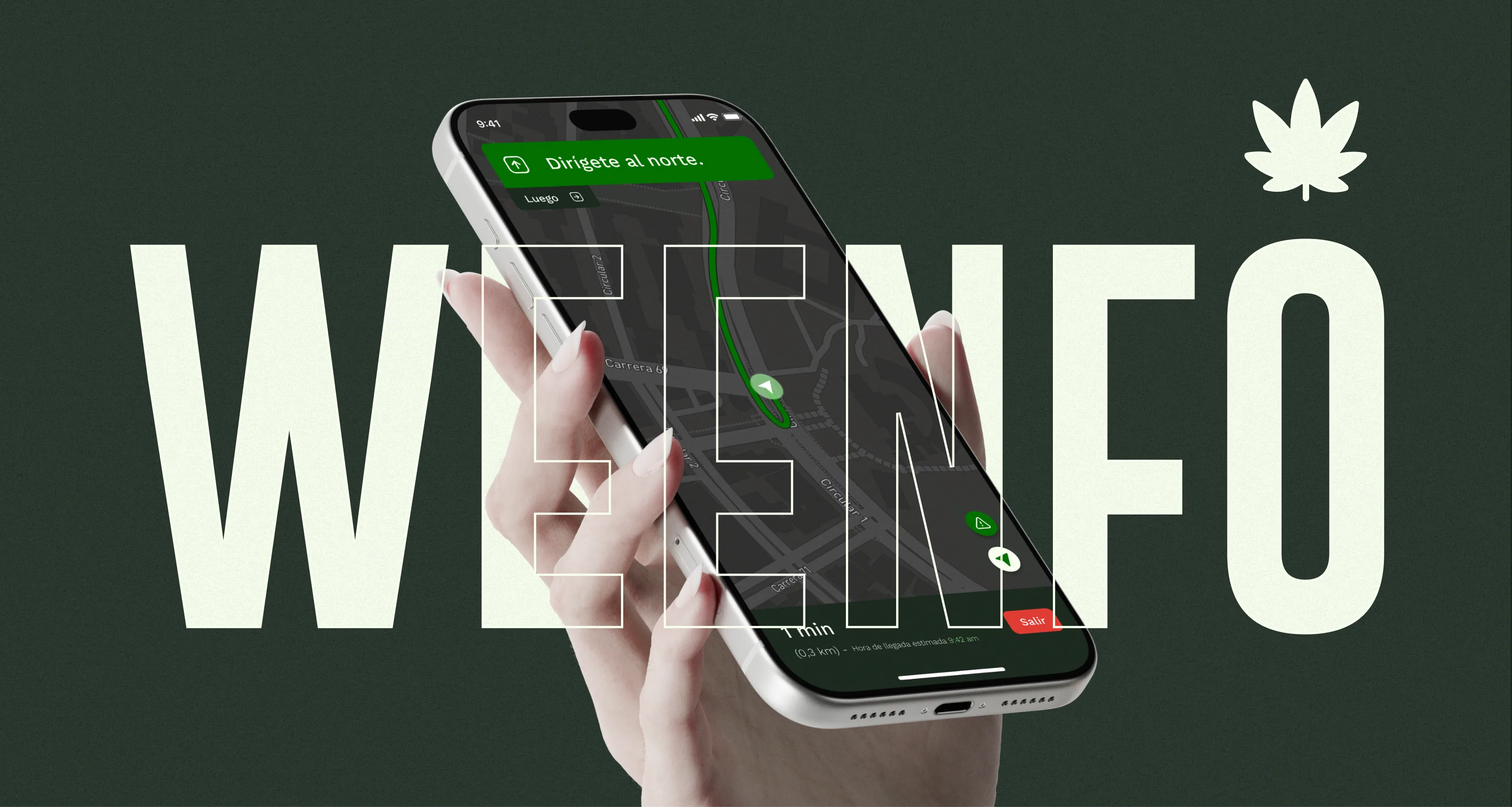
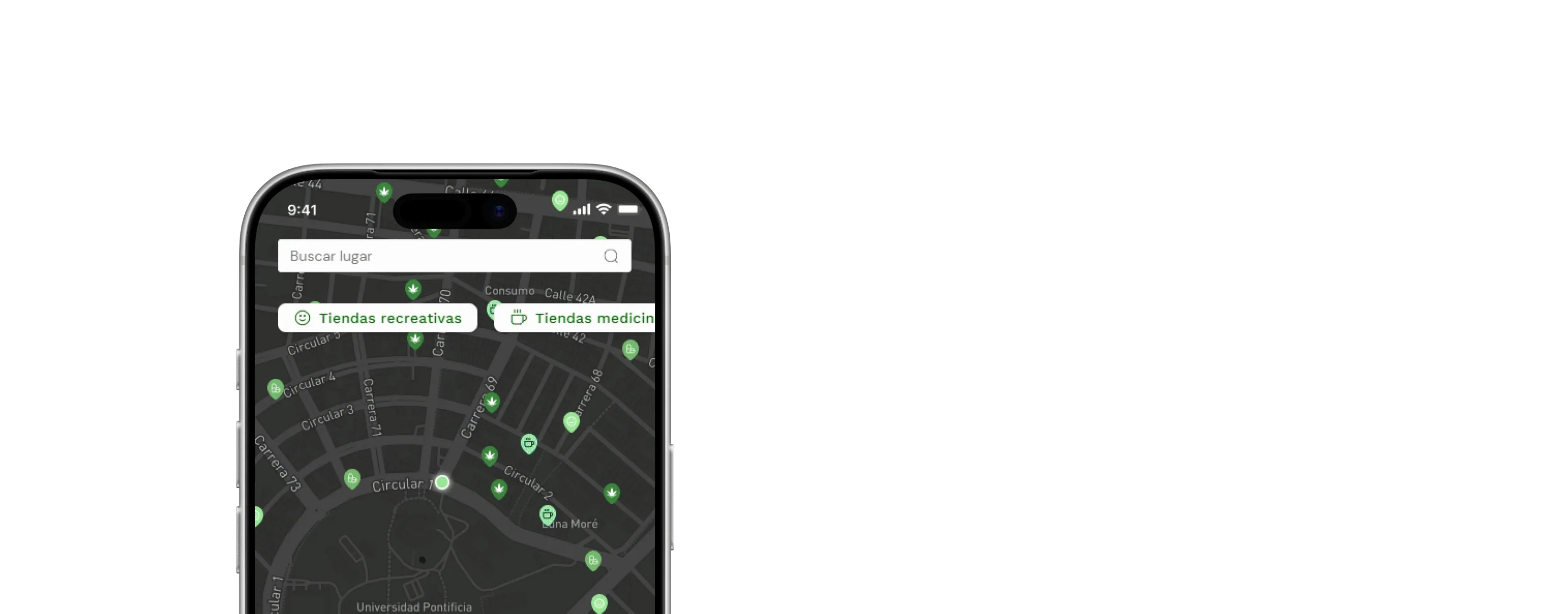
Weenfo started as a Progressive Web App that helped people look for cannabis products, and places to use them safely.
With the new features Weenfo became a mobile app where people focus on building communities of users, through virtual spaces for entertainment, learning, talking and getting to know each other.
Challenge
Weenfo started as a simple way to find cannabis-related locations. But we saw a chance to make it more useful by helping people connect, share what they had been through, learn about cannabis and come across new products.
The challenge was to bring all of that together without making the app feel complicated. We also wanted to take on the lack of trustworthy information and make a more welcoming space for a community that often faces stigma.
Our main goals:
Build a stronger community around shared interests. Make information and products easier to come across. Keep the experience simple, safe and accessible.

Approach
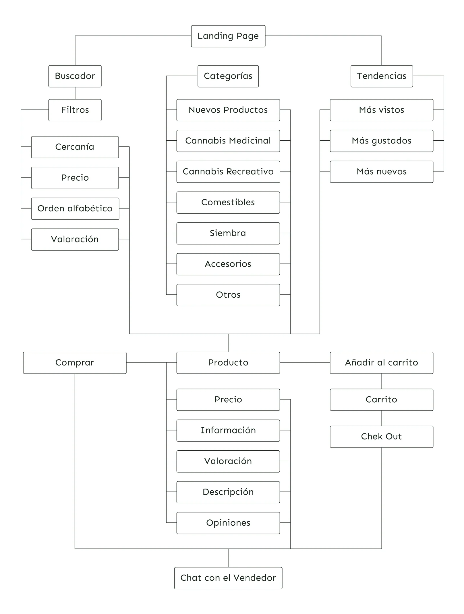
We started by exploring how Weenfo could better support the people using it. Through brainstorming sessions, experience mapping and user journeys, we found openings to improve how people come across content, interact with others and explore products.
We used the HEART framework to pin down the experiences we wanted to encourage, from learning something new to connecting with the community.
Rather than lean on our own assumptions, we took 10 people through a design critique and ran usability testing to understand where people struggled. Their feedback helped us rethink the interactions and improve the designs.
What guided our decisions:
Brainstorming and experience mapping. User journeys and the HEART framework. Design critiques, usability testing and iteration.
Results
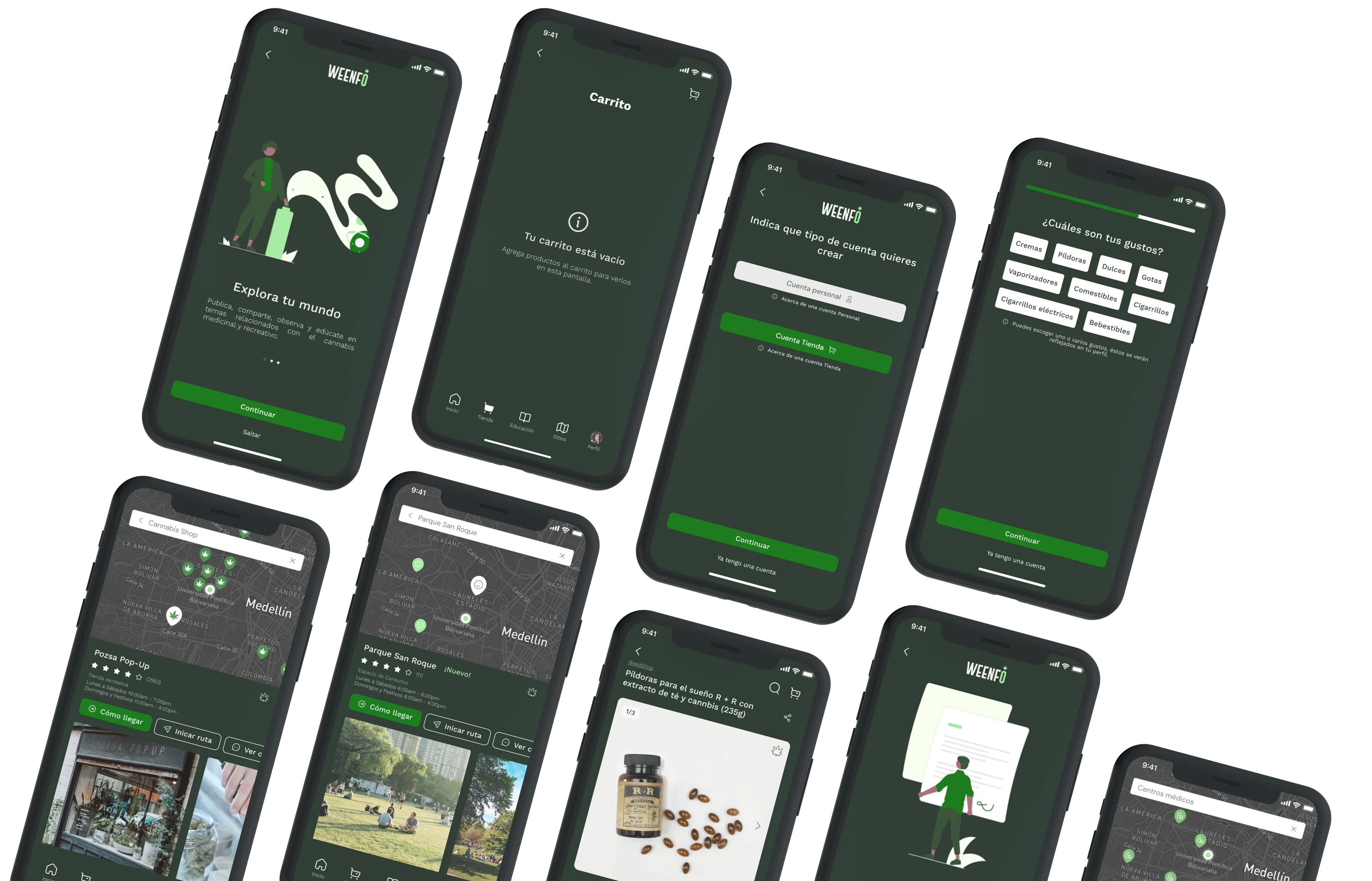
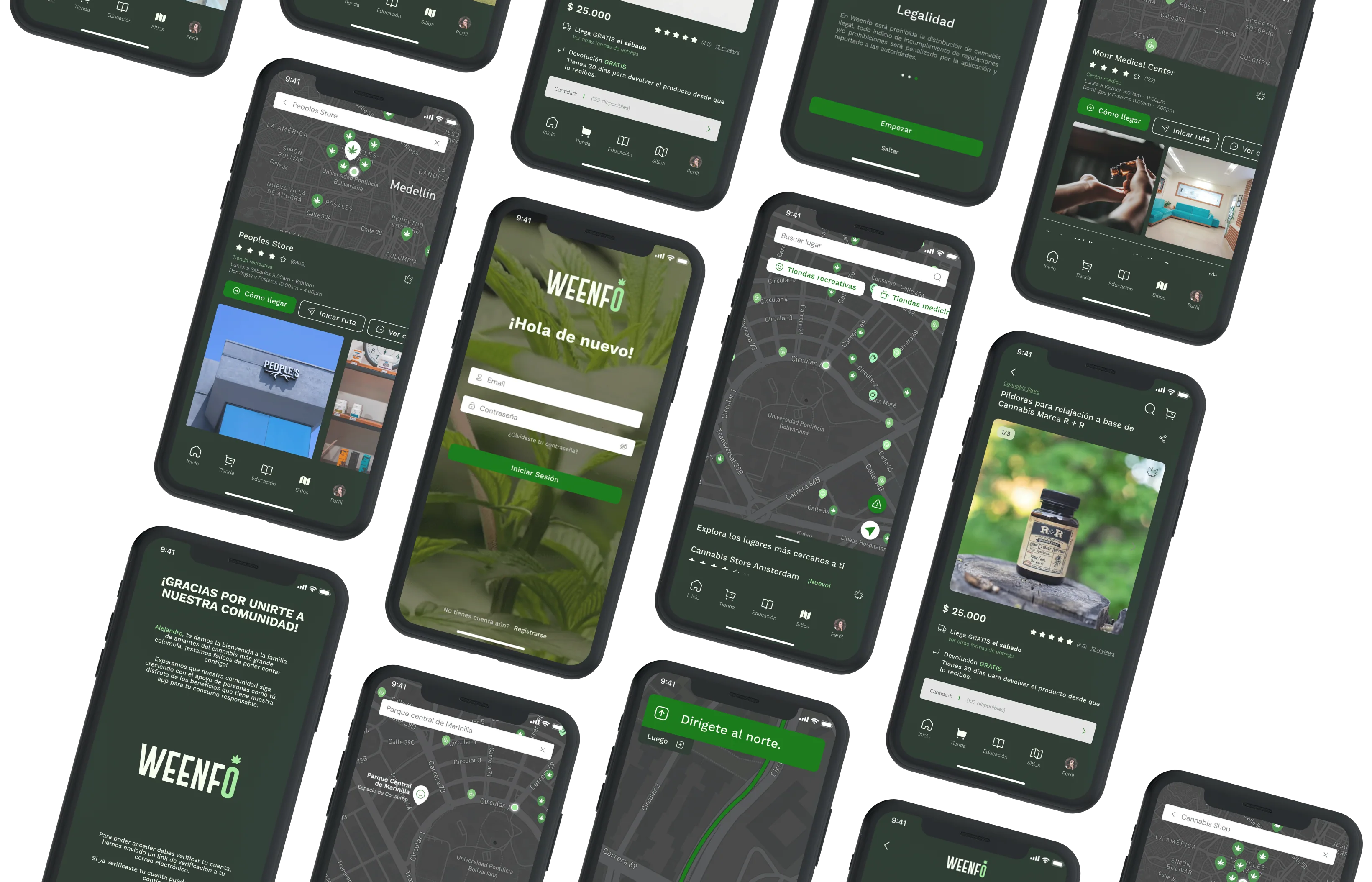
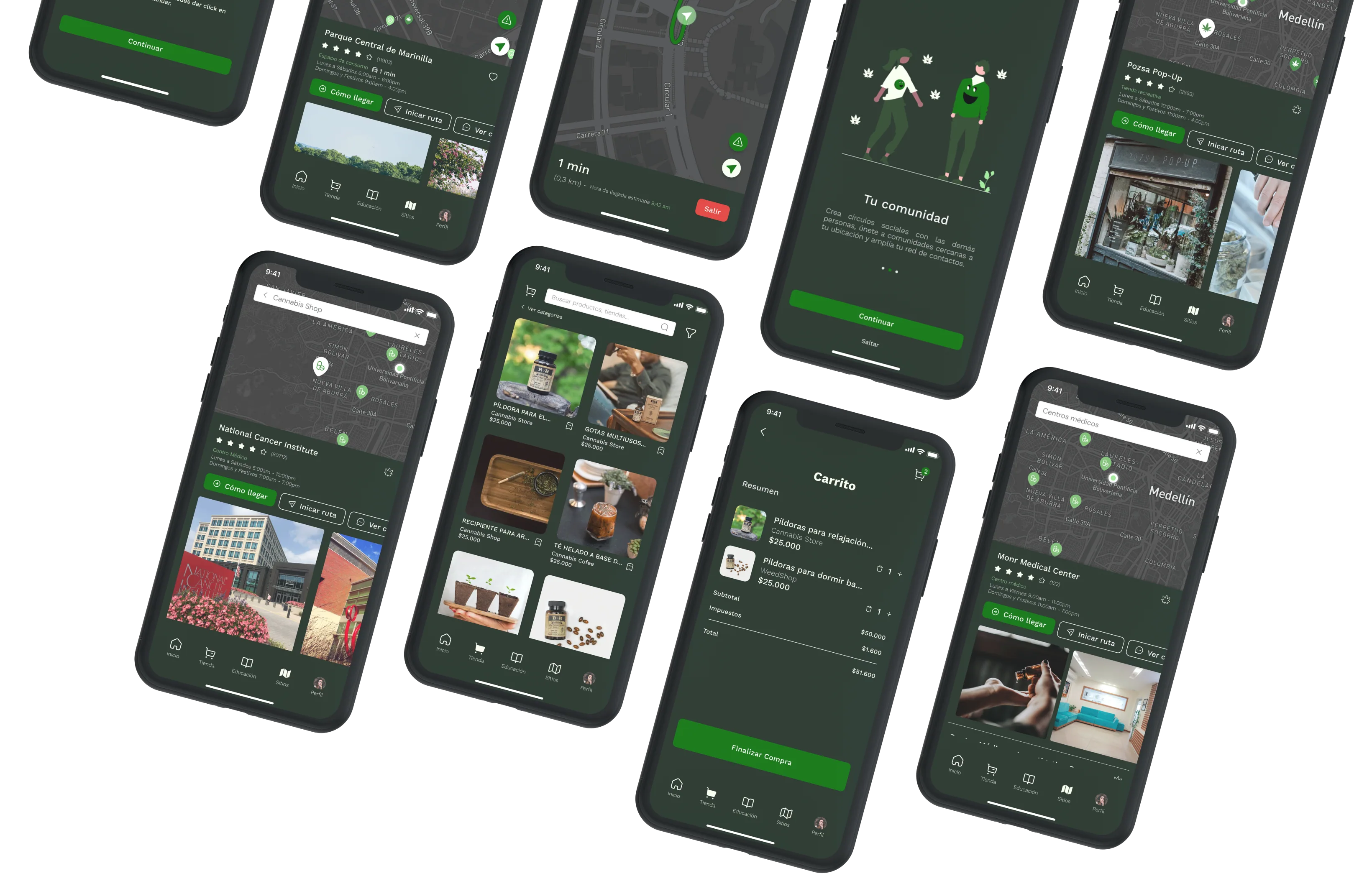
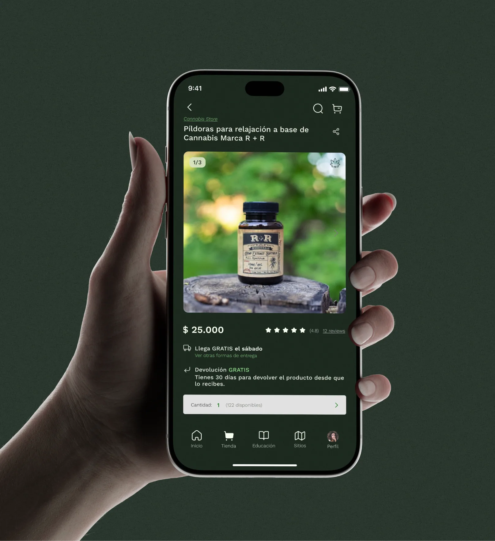
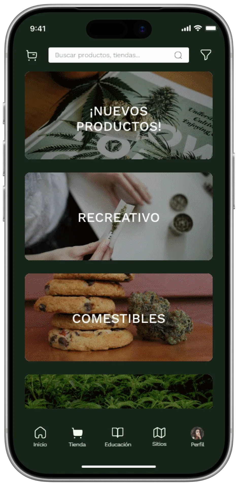
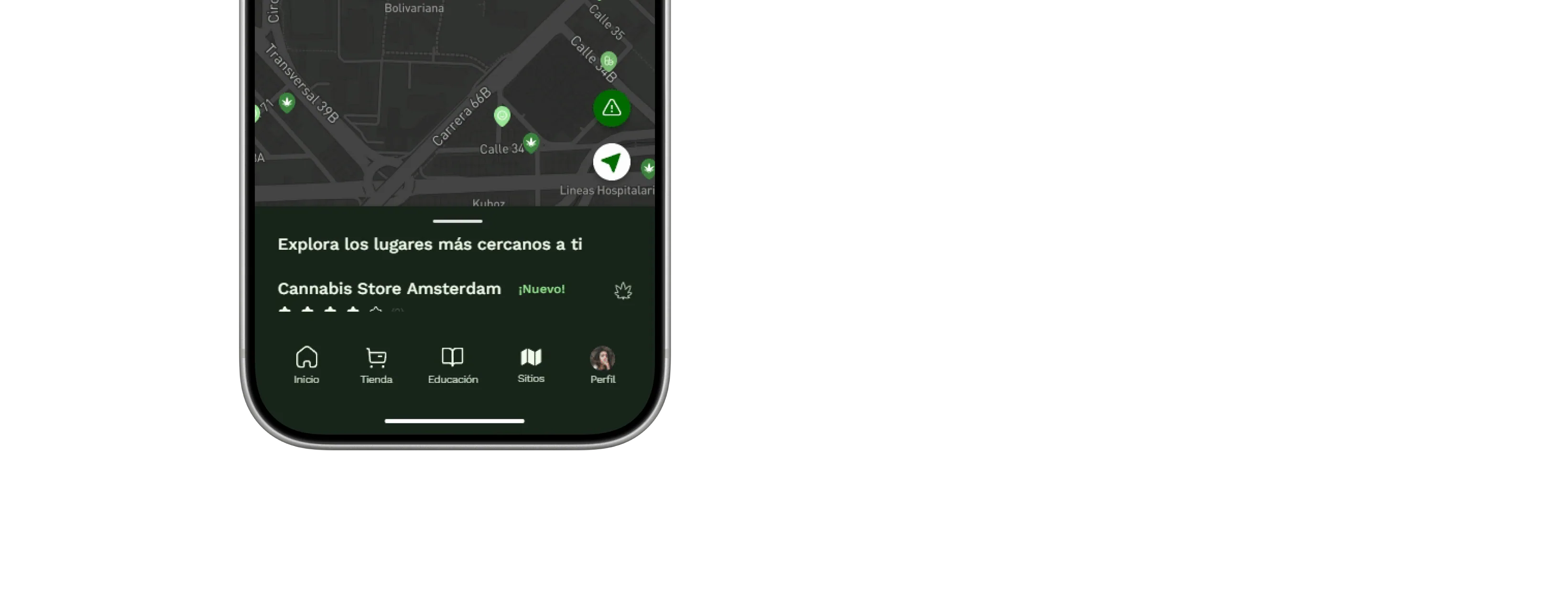
What came out of it was Weenfo 2.0, a redesigned interactive prototype that brought community, education, shopping and finding places together into one experience.
Testing helped us spot confusing interactions, make text more readable, refine the navigation and make important tasks easier to get through. Feedback from our design critiques also showed people reacting well to the visual direction and to how the product is organised.
Beyond the final screens, this project helped me grow as a designer. I learnt to work with a design system that scales, to make decisions off the back of user feedback, and to work with a team to turn different ideas into one coherent experience.
What we got to:
A fuller product experience with four new sections. A reusable design system for a consistent interface. Better accessibility and user flows through testing. A refined, high-fidelity prototype ready for development.